styled-components는 리액트에서 가능한 CSS작성법에서 CSS-in-JS 라이브러리들중 하나이다.
Table of Contents
- Table of Contents
- Why Styled components
- 설치
- 사용법
- props
- extend
asattribute- Attrs 지정
- Animation
- Selector
- Theme
- 참고 자료
Why Styled components
리액트에서는 스타일을 작성하는 방법이 아래와 같이 여러가지 존재한다.
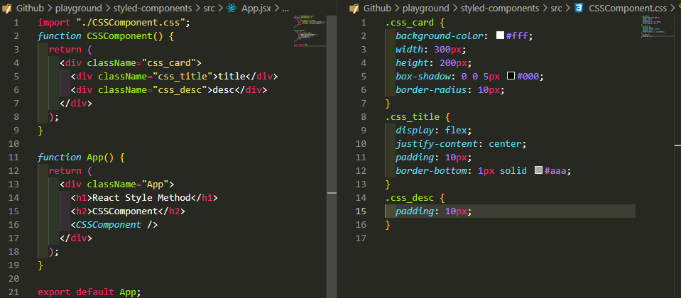
- 일반적인 css 작성:
*.css작성import '*.css'가져오기,className에 클래스명 작성(className="btn")
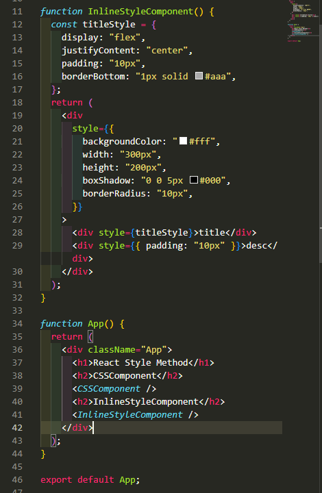
- inline style attribute 작성:
style={{backgroundColor:'red'}}
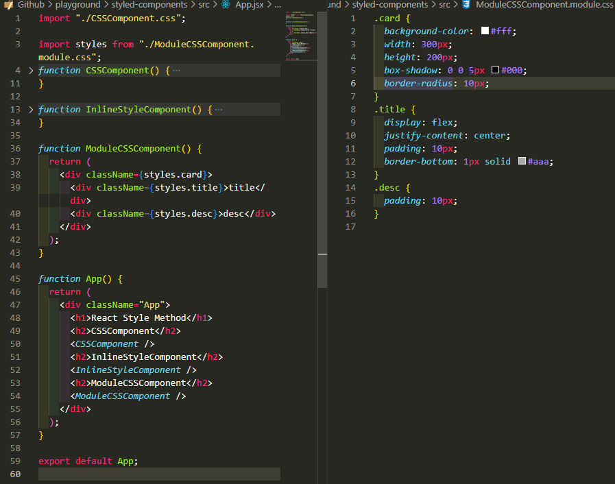
- 모듈 css 작성(scoped):
*.module.css작성import styles from '*.module.css'가져오기,className에 클래스명을 객체 형식으로 작성(claasName={styles.btn})
-
CSS-in-JS 방식(scoped)
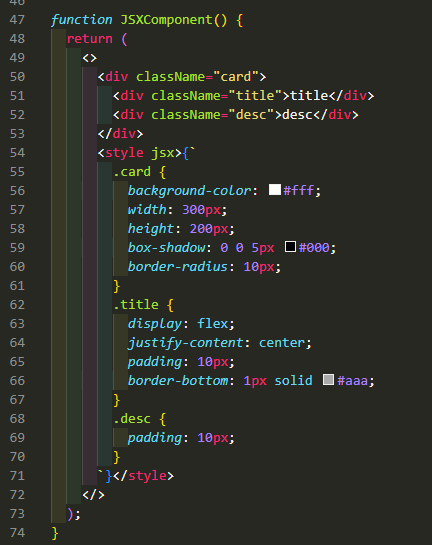
- styled jsx: 컴포넌트 jsx에
<style jsx></style>에 css 작성, 컴포넌트의 태그에className에 클래스명 작성(className="btn")
- styled jsx: 컴포넌트 jsx에
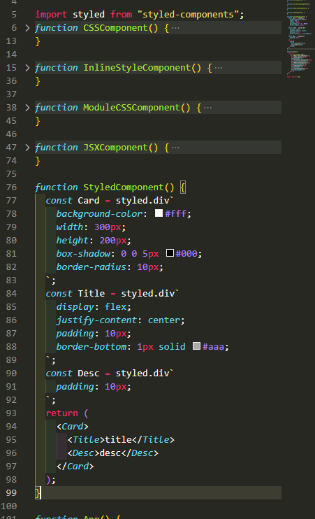
- styled components: const Title = styled.h1`css style` 처럼 style된 components를 작성
- emotion: 태그의
className에 css`css style`처럼 작성하여 스타일을 적용
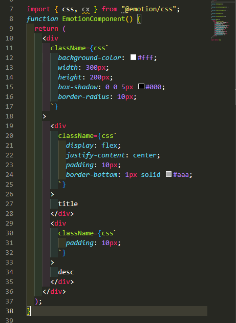
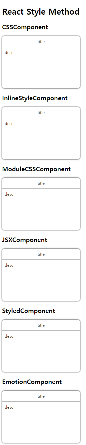
동일한 디자인을 각자의 방식으로 마크업, 스타일 한다는 것을 아래 결과를 통해 확인할 수 있다.
위와 같은 다양한 방법 중 styled-components를 사용해야 하는 이유를 알아보자.
위의 방법들 중 1, 2번은 scoped되지 않은 스타일로 여러 컴포넌트를 작성하다가 className이 겹치게 될 경우 CSS 충돌이 발생할 가능성이 있다.
3번은 1, 2번의 문제점을 극복할 수 있는 scoped를 지원하지만, 사용방법이 불편(작성이 오래걸려 작업 효율성 떨어짐)하다. 모든 클래스명을 모듈화 하면서 styles와 같은 객체명을 모두 붙여줘야 하고, 여러 클래스명이 필요한 태그의 경우는 백틱(`)연산이나, 배열에 넣고 join()함수를 사용해야 하는 등 작성해야 할 코드가 늘어난다.
이러한 이유에서 리액트에서 보통 CSS-in-JS를 통해 스타일 작업을 진행한다. 대부분의 CSS-in-JS는 scoped style을 지원한다.
4.1번 styled jsx 방식은 기존의 CSS 작성하듯이 할 수 있다는 장점이 있다. 단점으로는 VSC(Visual Studio Code)를 사용하는 경우 확장프로그램중 하이라이팅 기능을 제공하는 확장이 있으나 CSS속성들이 자동완성이 되지 않아 작업 효율성이 떨어진다. 또한 컴포넌트 내부에 <style jsx>태그를 작성해야 하다보니 컴포넌트 자체 코드 길이가 길어지는 단점도 존재한다.
4.2번 styled-components 방식은 4.1번의 단점인 자동완성 불가능, 컴포넌트 코드 길어지는 문제점을 해결할 수 있는 스타일 방식이다. 이외에도 styled-components에서 제공하는 다양한 편의성과 확장 가능성이 있는데 이 내용은 후술한다.
4.3번 emotion 방식은 styled-components의 방식에 css props라는 inline style이 가능한 기능이 추가됐다.
이 중 styled-components를 사용하는 이유를 정리하면 아래와 같다.
- Scoped 스타일을 통해 CSS 충돌 문제 해결
- 기존의 CSS 속성 작성방식과 유사하게 작성 가능(backgroundColor가 아닌 background-color)
- VSC 확장 기능을 통해 CSS 속성 자동 완성 가능
- 기존 CSS에선 불가능하거나 불편한 부분들에대한 편의성과 확장성 제공 (props 전달받아 CSS 속성값으로 활용, 컴포넌트 확장, theme 제공 기능 등)
- 기존 CSS 속성 작성방식, 컴포넌트 작성 후 사용하는 방식과 유사하므로 러닝커브가 비교적 완만
설치
# install styeld-components
npm i styled-components

# typescript를 사용하는 경우 모듈의 타입을 알려주기 위해
npm i @types/styled-components
사용법
styled components의 사용법은 아래와 같이 styled components를 import하고, 작성하고 싶은 컴포넌트의 태그네임이후 백틱 사이에 css를 작성하듯이 스타일을 작성해주면 된다.
작성한 스타일 컴포넌트는 기존의 리액트 컴포넌트를 사용하듯 <컴포넌트명/>, 혹은 텍스트가 존재하는 컴포넌트는 <컴포넌트명>텍스트</컴포넌트명>으로 사용할 수 있다.
import styled from "styled-components";
styled.tagName`style`;
// App.js
import styled from "styled-components";
const Container = styled.div`
display: flex;
`;
const BoxOne = styled.div`
background-color: red;
width: 100px;
height: 100px;
`;
const BoxTwo = styled.div`
background-color: blue;
width: 100px;
height: 100px;
`;
function App() {
return (
<Contianer>
<BoxOne />
<BoxTwo />
</Contianer>
);
}props
위 사용 예제를 보면 Box의 background-color속성을 제외하고 BoxOne과 BoxTwo는 스타일의 중복이 발생한다.
이런 경우 props를 이용해서 변경이 필요한 값만 props로 전달받아 변경할 수 있다.
styled components에서 props사용 예는 아래와 같다.
const Box = styled.div`
  background-color: ${(props) => props.bgColor};
  width: 100px;
  height: 100px;
`;

function App() {
  return (
    <Container>
      <Box bgColor="teal" />
      <Box bgColor="tomato" />
    </Container>
  );
}
extend
styled components는 확장할 수 있다. 예를 들어 아래와 같이 박스와 원의 스타일을 가진 코드가 있다고 하면, border-radius속성을 제외한 스타일이 중복된다.
const Box = styled.div`
  background-color: ${(props) => props.bgColor};
  width: 100px;
  height: 100px;
`;
const Circle = styled.div`
  background-color: ${(props) => props.bgColor};
  width: 100px;
  height: 100px;
  border-radius: 50px;
`;
이런 중복 코드를 제거하기 위해 styled components는 확장 기능을 제공한다. styled뒤에 괄호를 열고 이미 선언한 styled components를 넣으면 해당 컴포넌트의 모든 스타일을 가지고, 새롭게 지정한 스타일도 함께 가지고 있는 컴포넌트를 선언한다.
const Box = styled.div`
  background-color: ${(props) => props.bgColor};
  width: 100px;
  height: 100px;
`;
const Circle styled(Box)`
  border-radius: 50px;
`
as attribute
styled components는 컴포넌트를 선언할 때 태그명을 지정하는데, 컴포넌트에 선언한 스타일은 그대로 사용하고 태그명을 변경하고 싶을 때 as라는 attribute를 태그에 사용할 수 있다.
사용법은 아래와 같다.
const Btn = styled.button`
  color: white;
  background-color: tomato;
  border: 0;
  border-radius: 15px;
`;

function App() {
  return (
    <Container>
      <Btn>Log in</Btn>
      <Btn as="a" href="/">
        Log in
      </Btn>
    </Container>
  );
}
<Btn as="a" href="/">Login</Btn>코드를 보면 Btn에 선언해놓은 스타일을 그대로 사용하면서 태그명은 a태그로 변경할 수 있다.
href attribute처럼 태그를 변경함과 함께 변경한 태그의 기존 attribute를 사용할 수 있다.
Attrs 지정
카드 컨테이너의 카드들이나, 리스트의 리스트아이템처럼 반복호출되는 컴포넌트들이 있을 때 해당 컴포넌트에 attribute를 모두 지정하기 위해서는 엄청난 반복 작업이 필요할 것이다.
에를 들면 아래와 같이 form안의 여러 Input 컴포넌트가 존재하는 경우 required속성을 추가하려면 모든 컴포넌트에 반복 작업을 해줘야 한다.
const Input = styled.input`
  background-color: tomato;
`;

function App() {
  return (
    <form>
      <Input required />
      <Input required />
      <Input required />
      <Input required />
      <Input required />
      <Input required />
    </form>
  );
}
styled components는 이와같은 반복 작업을 줄일 수 있도록 컴포넌트를 선언할 때 attribute를 지정할 수 있게 만들었다.
컴포넌트에 attribute를 지정하는 방법은 아래와 같다.
const Input = styled.input.attrs({ required: true })`
  background-color: tomato;
`;

function App() {
  return (
    <form>
      <Input />
      <Input />
      <Input />
      <Input />
      <Input />
      <Input />
    </form>
  );
}
Animation
styled components에서 animation을 적용하기 위해선 keyframes를 이용해 애니메이션 스타일을 작성하고, 스타일 컴포넌트를 선언할 때 animation에 미리 작성한 keyframes를 넣어주면 된다.
const animation = keyframes`
from {
  transform: rotate(0deg)
} to {
  transform: rotate(360deg)
}
`;

const Box = styled.div`
  background-color: ${(props) => props.bgColor};
  width: 200px;
  height: 200px;
  animation: ${animation} 3s linear infinite;
`;

function App() {
  return (
    <Wrapper>
      <Box bgColor="tomato" />
    </Wrapper>
  );
}
Selector
styled components는 선언한 스타일 컴포넌트의 안에 다른 태그가 존재하는 경우 해당 태그를 스타일에서 선택(Select)할 수 있다. 또한 sass의 nesting 문법을 사용할 수도 있고, 가상 선택자도 사용할 수 있다.
const Box = styled.div`
  background-color: ${(props) => props.bgColor};
  width: 200px;
  height: 200px;
  animation: ${animation} 1s linear infinite;
  display: flex;
  align-items: center;
  justify-content: center;
  span {
    font-size: 30px;
    &:hover {
      font-size: 40px;
    }
  }
`;

function App() {
  return (
    <Wrapper>
      <Box bgColor="tomato">
        <span>😊</span>
      </Box>
    </Wrapper>
  );
}
태그명이 아닌 클래스명도 가능하다.
const Box = styled.div`
  background-color: ${(props) => props.bgColor};
  width: 200px;
  height: 200px;
  animation: ${animation} 1s linear infinite;
  display: flex;
  align-items: center;
  justify-content: center;
  .emoji {
    font-size: 30px;
    &:hover {
      font-size: 40px;
    }
  }
`;

function App() {
  return (
    <Wrapper>
      <Box bgColor="tomato">
        <span className="emoji">😊</span>
      </Box>
    </Wrapper>
  );
}
또한 스타일 컴포넌트도 선택할 수 있다.
const Emoji = styled.span`
  font-size: 30px;
`;

const Box = styled.div`
  background-color: ${(props) => props.bgColor};
  width: 200px;
  height: 200px;
  animation: ${animation} 1s linear infinite;
  display: flex;
  align-items: center;
  justify-content: center;
  ${Emoji} {
    &:hover {
      font-size: 80px;
    }
  }
`;

function App() {
  return (
    <Wrapper>
      <Box bgColor="tomato">
        <Emoji>😊</Emoji>
      </Box>
    </Wrapper>
  );
}
Theme
styled components는 테마를 지정할 수 있다. 가장 쉽게 와닿는 사용 예로 다크모드, 라이트모드를 지정할 때 사용할 수 있다.
개념은 기존 css의 :root 프로퍼티 변수처럼 프로퍼티의 값을 리터럴이 아닌 변수값으로 지정해주고, 테마에 따라서 변수값을 변경시키는 것이다.
- index.js에서 ThemeProvider import,
<App/>을<ThemeProvider></ThemeProvider>로 감싼다.
// index.js
import React from "react";
import ReactDOM from "react-dom/client";
import { ThemeProvider } from "styled-components";
import App from "./App";

const root = ReactDOM.createRoot(document.getElementById("root"));
root.render(
  <React.StrictMode>
    <ThemeProvider>
      <App />
    </ThemeProvider>
  </React.StrictMode>
);- Theme을 object로 선언하고,
<ThemeProvider></ThemeProvider>에 props로 전달한다. (추후 사용자 인터렉션에따라 theme props의 전달 객체를 변경해준다.)
// index.js
import React from "react";
import ReactDOM from "react-dom/client";
import { ThemeProvider } from "styled-components";
import App from "./App";

const darkTheme = {
  textColor: "whitesmoke",
  backgroundColor: "#111",
};
const lightTheme = {
  textColor: "#111",
  backgroundColor: "whitesmoke",
};

const root = ReactDOM.createRoot(document.getElementById("root"));
root.render(
  <React.StrictMode>
    <ThemeProvider theme={darkTheme}>
      <App />
    </ThemeProvider>
  </React.StrictMode>
);- styled components를 선언할 때 전달받은 theme를 호출해 프로퍼티의 값으로 사용한다.
// App.js
import styled from "styled-components";

const Wrapper = styled.div`
  display: flex;
  height: 100vh;
  width: 100vw;
  justify-content: center;
  align-items: center;
  background-color: ${(props) => props.theme.backgroundColor};
`;
const Title = styled.h1`
  color: ${(props) => props.theme.textColor};
`;

function App() {
  return (
    <Wrapper>
      <Title>Hello</Title>
    </Wrapper>
  );
}

export default App;